Imagining Politics
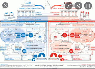
Did you know that based on a study conducted by Forbes magazine it was revealed that 65% of the world's population are visual learners, surprising right?So it makes sense why the use of infographics have gained more and more popularity. Infographics produce a separate story that produces a greater understanding. It brings together text and images as one idea rather than two separate entities. It is no secret that infographics can be especially useful in education, if it was implemented more. With technology improving day by day there seems to be more of a reliance on visuals more than anything. In the spirit of election season, I find it important to mention that during my elementary school years, I found it incredibly difficult to grasp the concept of politics. I often confused the left for the right. Sometimes I couldn't understand the culture that came with living in a bipartisan country. It wasn’t until my fifth grade teacher pulled out a diagram of both the left and right wing that things began to click.It helped me to understand that there were differences within each party and what each party stood for. The left believing in science, opting for the urban way of life, education, and social rights. While the right believes in religion, opting for a more rural way of life, jobs, and economic rights. Moreover, the diagram helped me understand that within each side are subgroups like leftist, liberals, radicals, and conservatives. The infographic made an otherwise complicated topic something easier to digest.


Comments
Post a Comment