Posts

The End

Image
As this semester comes to an end I find myself reminiscing on everything that I have learned in CASD 1643. There is so much that I, as a consumer and audience member, had not considered goes into designing visuals. For example, how choice of font can indicate the tone of what you’re going for. Bubble letters may indicate that whatever it is you're trying to show is playful and fun. Whilst sharper letters can indicate suspense or anxiety. Even choice of where to place a subject may be cause for consideration. A subject that is higher elevated in comparison to the rest of the elements may indicate that they are seen as some kind of divinity while a lowered subject might spark some kind of sympathy in the audience. This course has opened my eyes to a world of designers. Designers aren’t just those who go to school to study the field, but everyday careers can constitute as designers. For instance, W.E.B DuBois, though a civil rights activist, can be considered a designer as

Ping Pong Visuals

Image
  As a person that can be referred to as a member of Generation Z, visuals are everything. We have grown up in a technological age, some Generation Zers have their baby pictures saved on their parent's old cell phones. It is not a stretch to say that we are living in some strange times, in which the world is being reshaped as a result of the Coronavirus (COVID 19). I vividly remember being in class and this girl believing that because we weren't going into class it meant that she had more time to party. Sadly, at the time I did agree with her. It was still the time when President Donald Trump downplayed the effects of the virus on the general public. It was hard to visualize something we had never seen before. One case turned into two which turned into hundreds and finally thousands. The Real Ohio Art group was able to help the public visualize how important it was for the American people to do their part. By placing several ping pong balls on mouse traps that are close togethe

Graphics in Action

Image
         One of the few things that have been made evident this year is that the United States is not as progressive as we once thought it was,and that this country is a nation that is divided. Although it is divided by politics it is more notably divided by race. Some people believe racism exists while others don't. Among the many arguments made by racist individuals is that Black people should just " stop being lazy and put in the effort". However, numbers don't lie, it's not that Black people aren't putting in the effort,but rather, that the systematic injustices at all levels is preventing them from succeeding. Founder of the NAACP, W.E.B DuBois was able to present this information, visually. DuBois conducted a study about African-American life to the Exposition Universelle, the Paris World Fair in which he attempted to show the progress that Black people have made since slavery while simultaneously being compared to White Americans. DuBois was very strate

ByeDON

Image
      Regardless of if you accept this fact or not, Joe Biden is our president-elect. It is a wonder,however, a wonder how Joe Biden was able to win the election against Donald Trump. Trump is a man who has a cult-like following that is united together by the phrase "Make America Great Again" (MAGA). Trump supporters would go out of their way to have his merchandise on just about anything, hats, t-shirts, dresses, masks, phone cases, you name it. And yet Joe Biden was able to successfully win this election through the use of visual marketing. In 2016, the end of the Obama presidency brought on a wave of Joe Biden memes that showcased Joe Biden as the funny and overall cool uncle. Biden's campaign played this up often opting to use adrenaline inducing rap music over his campaign music. This particular song was Eminem's "Lose Yourself" a song often associated with sports and getting ready for some kind of sports event.Similar to the "Gonna Fly Now"so

Maps Make their Mark

Image
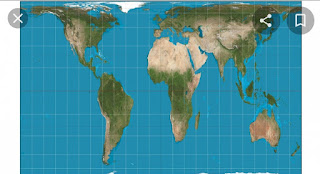
         It is hard to grasp the concept that racism manifests itself in every aspect of life. Even something almost as finite as geography. In doing last week's assignment I realized the power a person has when they design something intended for the masses. The map of the world is an example of this, it was originally used to help aid in travels. But now, a map of the world represents pride as well as ignorance. It is easy for a country to have pride in their country when they see themselves as big or bigger than other countries. And this is primarily because size often coincides with power. The nature of a continent like Africa is that it has poor individuals,no wealth, and dirty. It is seen as a charity case, no one ever talks about its wealth,beaches, and food.But, in actuality it is nine times larger than most of Europe and is larger than Greenland despite appearing to be the same size. The map that we are used to is oriented and based entirely on Eurocentric and Western ideal

Imagining Politics

Image
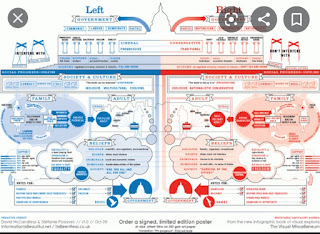
        Did you know that based on a study conducted by Forbes magazine it was revealed that 65% of the world's population are visual learners, surprising right?So it makes sense why the use of infographics have gained more and more popularity. Infographics produce a separate story that produces a greater understanding. It brings together text and images as one idea rather than two separate entities. It is no secret that infographics can be especially useful in education, if it was implemented more. With technology improving day by day there seems to be more of a reliance on visuals more than anything. In the spirit of election season, I find it important to mention that during my elementary school years, I found it incredibly difficult to grasp the concept of politics. I often confused the left for the right. Sometimes I couldn't understand the culture that came with living in a bipartisan country. It wasn’t until my fifth grade teacher pulled out a diagram of both the left an

A Heartfelt Design

Image
      It is no secret that visual designers have a lot on their plate when choosing what the world sees. A visual that is overly simplified to the public can prevent the message from properly being conveyed. And over complicated messages can confuse the public. Designers choose symbols to narrow down a complex idea into an idea that is easier to grasp. For instance, Dan Higgins and Alissa Eckert were tasked with helping the Central for Disease Control(CDC) and they designed what I can only describe as the spiky blobs you find in the gumball machines as kids. Higgins and Eckert wanted the virus to look as realistic as possible so people could comprehend how something nonexistent to the human eye can be so harmful. Adding the stone like texture to the ends of the spikes adds to the realism, almost as if you could touch it.        This idea of using a symbol to represent a complex idea reminds me of the symbol we use for the heart. We know that the human heart, or any living heart does no

A Recap

Image
      As I metaphorically stand at the center of this unusual fall semester I find myself retracting my previous views. A designer's job is one that is not just crucial, but it is very calculated. There are several things to consider when designing an ad or a visual. For instance, designers must rely heavily on the knowledge of their audience in order for the elements of their visual to make sense. They must consider who their audience is and the time period in which their visual will exist in order to communicate the message of their visual effectively. I suppose even when I finally understood the elements of visual communication, my immediate association was always that it was some kind of capitalistic tool used to prey on innocent consumers. But, in actuality, these elements can be used in different aspects, photographers can use the placement and color choices to convey the message of powerful movements. In the past, a center placement of Martin Luther King Jr. that was angled

Icon or Fraud

Image
            The word icon seems to have developed into everyday slang. It simply means a person that is formidable and well respected. One might describe Beyoncé, Michael Jackson, or Lady Gaga as an icon. Or one  could use the phrase as an Instagram caption. Nonetheless, its meaning differs greatly from the definition in " Visual Communication Design: An Introduction to Design Concepts in Everyday Life ". The text states, "An icon is a type of sign that physically resembles the concept or thing for which it stands" (151). As I was reading this particular chapter, I found myself wondering about the most controversial icon there is by this textbook book definition--Jesus. When people think of Jesus or God, the common characteristics are long brown or black hair, a beard, and pale skin. It is the pale skin that is so controversial. For someone who comes from Palestine, Jesus sure looks like a White guy. The argument is that Jesus is not White at all, but rather, a pers

The Big Bang theory

Image
In doing this past week's assignment on story books, there was a lot to expect  and a few things that took me by surprise. For instance reducing these character designs to just shapes was tricky. How can one convey the personality of a character, something that is incredibly complex, into a simple oval? And that's where Molly Bang came into play. Bang's principles narrowed down what I could do and how I could do it. I could convert so much about a character from color. The contrast of the light pink color of the pigs to the gloomy and scary grey and red of the wolf showed that it was both menacing and unsettling. The three pigs were accessoried with other different colors,pig one wore glasses,pig two wore a red hat, and pig three simply had a green triangle. The green triangle helped to indicate that it was ultimately that pig that made the proper decision while building its house.Moreover, the shapes I decided to use also helped me stay consistent and express which c