Maps Make their Mark
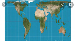
It is hard to grasp the concept that racism manifests itself in every aspect of life. Even something almost as finite as geography. In doing last week's assignment I realized the power a person has when they design something intended for the masses. The map of the world is an example of this, it was originally used to help aid in travels. But now, a map of the world represents pride as well as ignorance. It is easy for a country to have pride in their country when they see themselves as big or bigger than other countries. And this is primarily because size often coincides with power. The nature of a continent like Africa is that it has poor individuals,no wealth, and dirty. It is seen as a charity case, no one ever talks about its wealth,beaches, and food.But, in actuality it is nine times larger than most of Europe and is larger than Greenland despite appearing to be the same size. The map that we are used to is oriented and based entirely on Eurocentric and Western ideals. The only reason we view the map in a way that makes the Northern Hemisphere the top of the map and the Southern Hemisphere the bottom of the map is because explorers and travelers would use the North star as a point of direction. In the past Chinese cartographers oriented the map in a different way in which it faced west because their compasses had North facing that way. It is concerning and yet not surprising that the world simply accepts this Eurocentric map as the default.


Comments
Post a Comment