Posts

Showing posts from October, 2020

A Heartfelt Design

Image
      It is no secret that visual designers have a lot on their plate when choosing what the world sees. A visual that is overly simplified to the public can prevent the message from properly being conveyed. And over complicated messages can confuse the public. Designers choose symbols to narrow down a complex idea into an idea that is easier to grasp. For instance, Dan Higgins and Alissa Eckert were tasked with helping the Central for Disease Control(CDC) and they designed what I can only describe as the spiky blobs you find in the gumball machines as kids. Higgins and Eckert wanted the virus to look as realistic as possible so people could comprehend how something nonexistent to the human eye can be so harmful. Adding the stone like texture to the ends of the spikes adds to the realism, almost as if you could touch it.        This idea of using a symbol to represent a complex idea reminds me of the symbol we use for the heart...

A Recap

Image
      As I metaphorically stand at the center of this unusual fall semester I find myself retracting my previous views. A designer's job is one that is not just crucial, but it is very calculated. There are several things to consider when designing an ad or a visual. For instance, designers must rely heavily on the knowledge of their audience in order for the elements of their visual to make sense. They must consider who their audience is and the time period in which their visual will exist in order to communicate the message of their visual effectively. I suppose even when I finally understood the elements of visual communication, my immediate association was always that it was some kind of capitalistic tool used to prey on innocent consumers. But, in actuality, these elements can be used in different aspects, photographers can use the placement and color choices to convey the message of powerful movements. In the past, a center placement of Martin Luther King ...

Icon or Fraud

Image
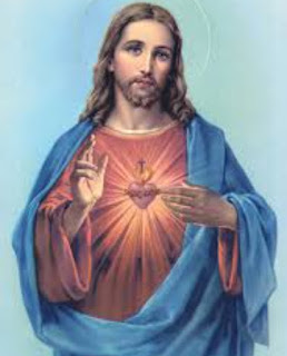
            The word icon seems to have developed into everyday slang. It simply means a person that is formidable and well respected. One might describe Beyoncé, Michael Jackson, or Lady Gaga as an icon. Or one  could use the phrase as an Instagram caption. Nonetheless, its meaning differs greatly from the definition in " Visual Communication Design: An Introduction to Design Concepts in Everyday Life ". The text states, "An icon is a type of sign that physically resembles the concept or thing for which it stands" (151). As I was reading this particular chapter, I found myself wondering about the most controversial icon there is by this textbook book definition--Jesus. When people think of Jesus or God, the common characteristics are long brown or black hair, a beard, and pale skin. It is the pale skin that is so controversial. For someone who comes from Palestine, Jesus sure looks like a White guy. The argument is that Jesus is no...

The Big Bang theory

Image
In doing this past week's assignment on story books, there was a lot to expect  and a few things that took me by surprise. For instance reducing these character designs to just shapes was tricky. How can one convey the personality of a character, something that is incredibly complex, into a simple oval? And that's where Molly Bang came into play. Bang's principles narrowed down what I could do and how I could do it. I could convert so much about a character from color. The contrast of the light pink color of the pigs to the gloomy and scary grey and red of the wolf showed that it was both menacing and unsettling. The three pigs were accessoried with other different colors,pig one wore glasses,pig two wore a red hat, and pig three simply had a green triangle. The green triangle helped to indicate that it was ultimately that pig that made the proper decision while building its house.Moreover, the shapes I decided to use also helped me stay consistent and express which c...